
In this blog, we talk about how analyzing oncology data with Power BI and gaining insights can aid healthcare organizations in the battle against cancer. This blog aims to provide valuable insights for business analysts looking to stay up to date on the latest trends, developments, and opportunities in the healthcare industry related to cancer diagnosis, treatment, and research.
Cancer is a significant and growing challenge for healthcare systems worldwide. According to the World Health Organization, cancer is the second leading cause of death globally, with an estimated 10 million deaths in 2020 alone. This represents a significant burden on healthcare systems and presents an opportunity for businesses to develop innovative solutions to address this challenge.
Business Intelligence (BI) involves the use of data analytics tools and techniques to gather, analyze, and present data to support business decision-making. Below are some ways healthcare organizations can analyze Oncology Data with Power BI and the different details that can be visualized through the reports.
Data Analysis using recent trends of Power BI
Power BI is a business intelligence and data visualization tool that enables users to connect to various data sources, create interactive reports and dashboards, and share them with others. It is a powerful tool for analyzing big datasets and gaining insights that can aid in decision- making. Power BI has grown in popularity in the healthcare sector in recent years, where it is used to analyze patient data, clinical trials, and other healthcare-related data.
Identify cancer metrics: BI tools can be used to analyze cancer data from various sources such as electronic health records (EHR), insurance claims, and public health data to identify the prevalence and incidence rates of different types of cancer. This information can help businesses identify market opportunities related to cancer diagnosis and treatment.
Here’s an overview of how data is collected, cleaned, transformed and can be represented in visuals.
Data Collection
The first step in using Power BI to analyze cancer is to gather data. Power BI includes the ability to connect to various data sources. We will use the National Cancer Institute’s Surveillance, Epidemiology, and End Results (SEER) Program dataset, which contains information on cancer cases . The dataset includes information on patient demographics, cancer type, stage at diagnosis, treatment, and survival.
Data Cleansing
The next step is to clean the data after it has been loaded into Power BI. Data cleaning entails removing missing values, duplicates, and any other errors found in the data.
Data Modeling
After importing the data into Power BI, we will create a data model. In the data model, we will create relationships between tables and define measures and calculated columns. Measures are calculations that aggregate data, such as the number of cancer cases or the average age at diagnosis.
Calculated columns are columns that are created using a formula, such as calculating the BMI of a patient based on their height and weight.
Data Visualizations
We can now create various visualizations using the data model. One of the recent updates in Power BI is the introduction of smart narratives. Smart narratives allow us to add narratives to our visualizations automatically. We can use this feature to add descriptions to our charts and tables, explaining what the data means and why it is important.
For example, we can create a stacked column chart that shows the number of cancer cases by cancer type and stage at diagnosis. We can add a smart narrative that explains that the chart shows the distribution of cancer cases by cancer type and stage, and that the chart can be used to identify the most common cancer types and stages at diagnosis.
Analyzing Cancer Measures
Analyzing cancer is essential for several reasons:
- Understand cancer prevalence and incidence: Analyzing cancer helps us understand the prevalence and incidence rates of different types of cancer. This information is crucial for developing effective cancer prevention and control strategies, identifying high-risk populations, and allocating healthcare resources to address the burden of cancer
- Identify risk factors and causes: Analyzing cancer data can help us identify risk factors and causes of different types of cancer. This information can help us develop effective cancer prevention strategies and reduce the incidence of cancer.
- Develop effective cancer treatments: Analyzing cancer data can help us understand the biology and behavior of different types of cancer. This information is critical for developing effective cancer treatments that target specific types of cancer cells and minimize harm to healthy cells.
- Monitor cancer trends and outcomes: Analyzing cancer data over time can help us monitor cancer trends and outcomes. This information can help us identify changes in cancer incidence and mortality rates, evaluate the effectiveness of cancer prevention and treatment programs, and inform healthcare policy decisions.
- Improve cancer patient care: Analyzing cancer data can help us improve cancer patient care by identifying gaps in care, developing evidence-based treatment guidelines, and improving cancer patient outcomes.
Here are a few trends to analyze Oncology Data with Power BI more efficiently.
Analyze Survival Rate using Sparkline
Survival rate: This refers to the proportion of people diagnosed with cancer who are still alive after a specified period. Survival rates can help assess the effectiveness of cancer treatments and can be used to identify areas for improvement in cancer care. Sparklines are used to show trends in a series of values, such as increases or decreases or to highlight max and min values.
To analyze the trends of cancer survival rate –
-
- Create a table or matrix.
- Select the dropdown arrow next to one of the numeric fields, and select Add a sparkline
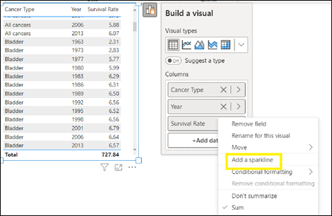
- In the dialog box, configure the details of your sparkline. The numeric field you started with is pre-populated for the Y-axis. You can change field and Summarization type, if needed. You also need to select a field, typically a date field, to use as the X-axis of the sparkline.
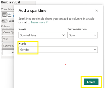
- Select Create. The sparkline is automatically added to your table or matrix as a new column.

- Select the dropdown arrow next to sparkline and select Edit sparkline.

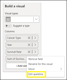
- In the Sparklines card in the Format pane, modify the sparkline line and marker formatting. Change the line color and width, add markers for different value types (highest, first, last, and so on), and change the marker size, color, and shape.

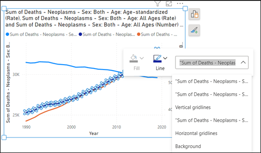
Visualize Cancer Mortality Rates using Line Charts
Mortality rate: This refers to the number of deaths caused by cancer in a population over a specified period. Mortality rates can help assess the impact of cancer on a population and can be used to identify disparities in cancer outcomes among different demographic groups.
The best indicator of progress against cancer is a change in age-adjusted mortality (death) rates, although other measures, such as quality of life, are also important.
To observe the changes, line charts are used and with the new feature format a visual on object, we can cross highlight and cross filter by right clicking on the visual.
To analyze the mortality rate measures, in a few cases we have overlapping data elements. Power BI takes the best guess at our selection. If we want to modify it, right-click and use the dropdown menu to change your selection to the element you’d like to format.
Visibility of Prevalence of Cancer by Age
Prevalence is defined as the number or percent of people alive on a certain date in a population who previously had a diagnosis of the disease.
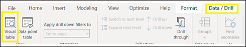
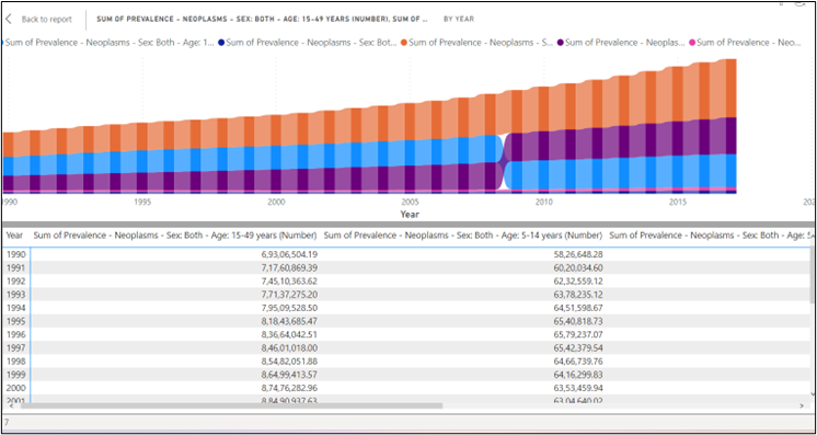
Information on prevalence can be used for health planning, resource allocation, and an estimate of cancer survivorship. Power BI is providing a new feature to show the data underlying the visual to view the data in the form of a table along with the visual.
For this:
-
- Use Visual table to display the data underlying a visual. Visual table is available from the Data/Drill tab in the ribbon when a visual is selected.
- When you select Visual table or Data point table, Power BI displays both the visual and the textual representation of the data. In the horizontal view, the visual is displayed on the top half of the canvas, and the data is shown on the bottom half.
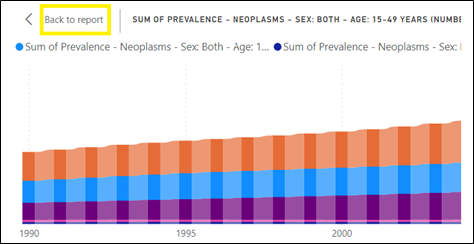
- To get back to the report, select < Back to Report in the upper-left corner of the canvas.
Analyze Cancer Cases using Small Multiples
With this growing global burden, prevention of cancer is one of the most significant public health challenges of the 21st century. For this it is essential to explore which countries have the highest cancer cases of different types. For this:
-
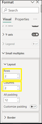
- Create small multiples on column chart and drag the country field into the small multiples in the fields section of Build visual pane.
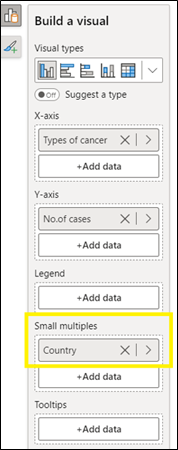
- Analyze number of cases of different types of cancer across countries. So, change the layout dimensions accordingly.
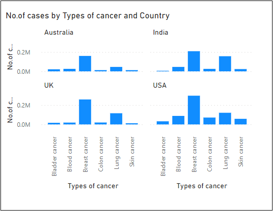
- Number of cases by types of cancer and country is analyzed as shown below –
AI Insights within Power BI
Machine learning and artificial intelligence (AI) are also playing an increasingly important role in cancer analysis. These technologies can analyze large amounts of data and identify patterns that might not be immediately apparent to human researchers. This can help accelerate the development of new cancer treatments and improve the accuracy of cancer diagnoses.
AI Insights in Power BI can also be used to analyze metrics of cancer.
Apply Insights in Power BI to explain Incidence Rate of Breast Cancer
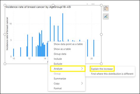
Often in visuals, you see a large increase and then a sharp drop in values and wonder about the cause of such fluctuations. To use insights to explain increases or decreases seen on charts, just right-click on any data point in a bar or line chart and select Analyze > Explain the increase or decrease.
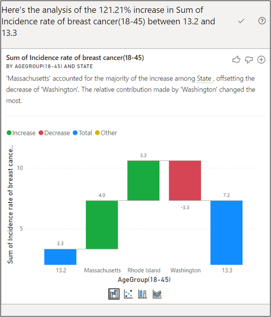
Power BI then runs its machine learning algorithms over the data and populates a window with a visual and a description that describes which categories most influenced the increase or decrease. By default, insights are provided as a waterfall visual, as shown in the following image.
Wrapping Up
Microsoft Power BI is an important tool for anyone working in the healthcare industry due to its ability to connect to various data sources, create interactive reports and dashboards, and safeguard confidential data. By analyzing oncology data with Power BI, we can gain insights that will help us better comprehend the disease, develop new treatments, and, eventually, save lives.
VNB Health Solutions is a Healthcare Analytics services provider with expertise in data governance, data integration, data warehousing, data science and data visualizations. Please connect with us to learn more about our Healthcare Analytics services.